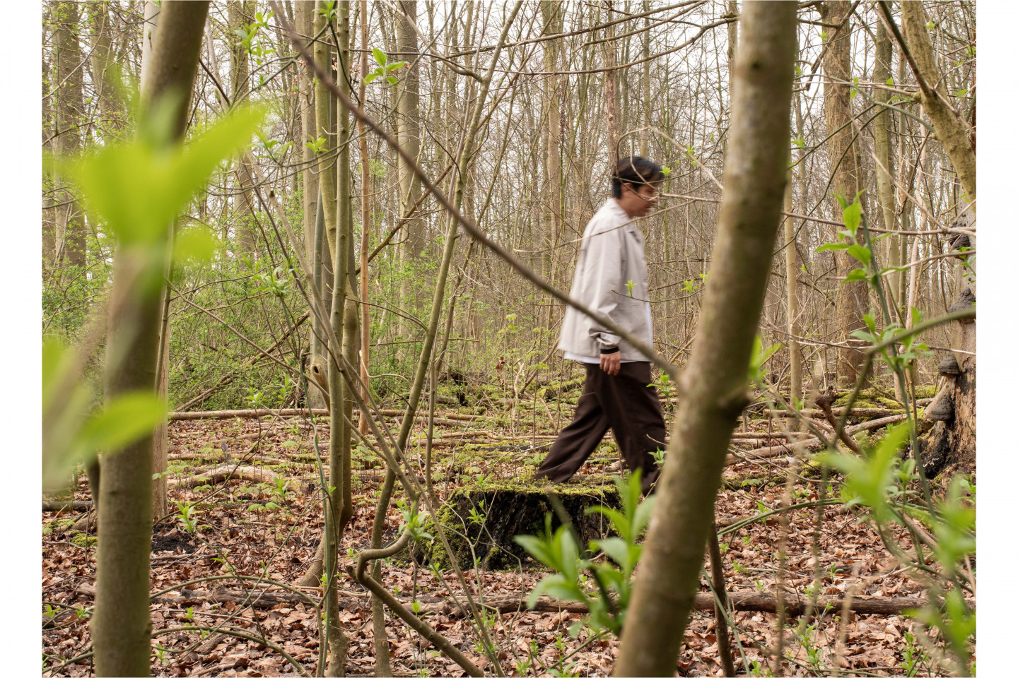
At his suggestion I meet Jonathan Castro Alejos in front of the De Boswinkel, a shop in the Amsterdamse Bos which sells all sorts of things around forests, wood and the park itself. Jonathan is a Peruvian graphic designer, multidisciplinary artist, and occasional musician in his thirties. He is also the person behind the new visual identity of Dekmantel.
Words by Alix de Massiac
Photography by Bianca Paul, Ted Grindei & Evi Cats
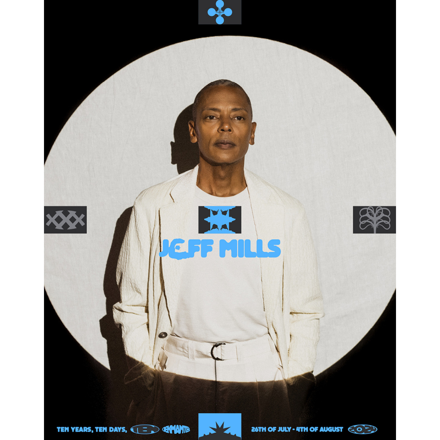
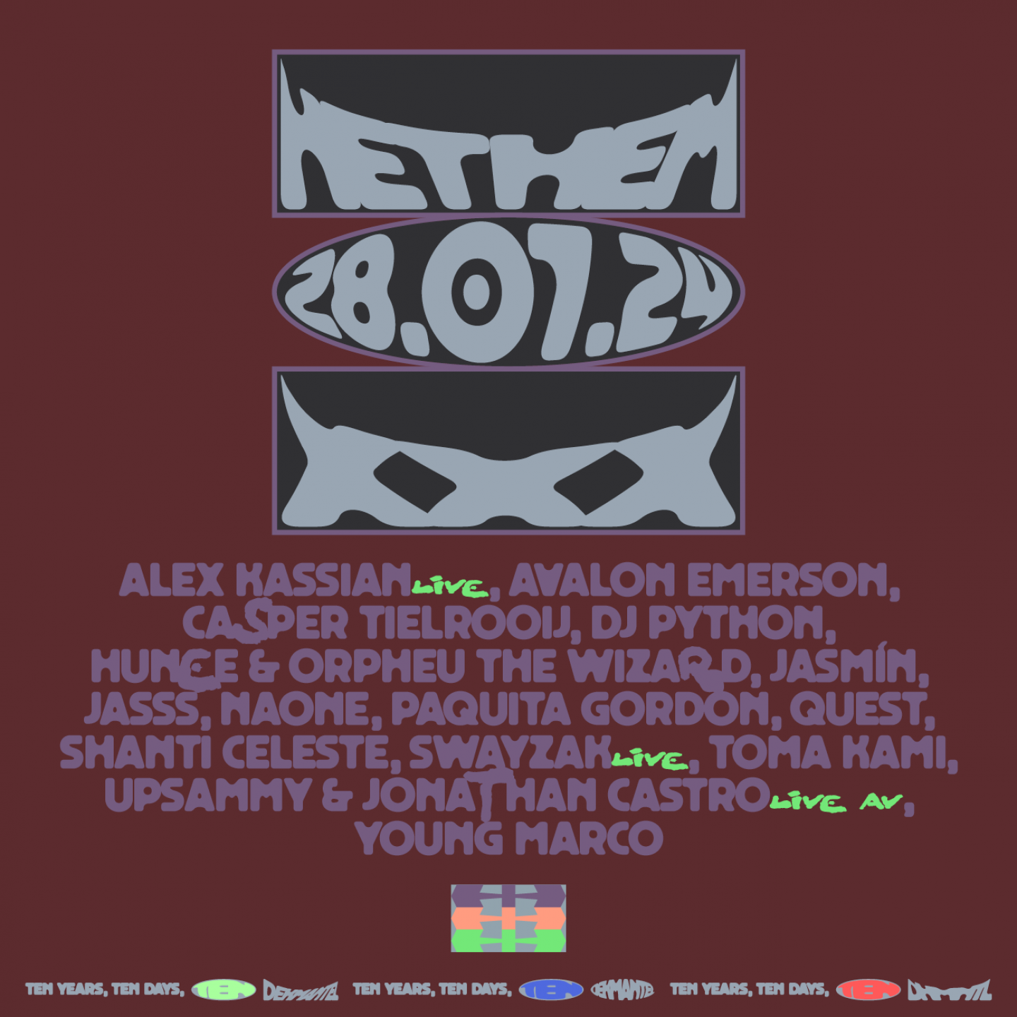
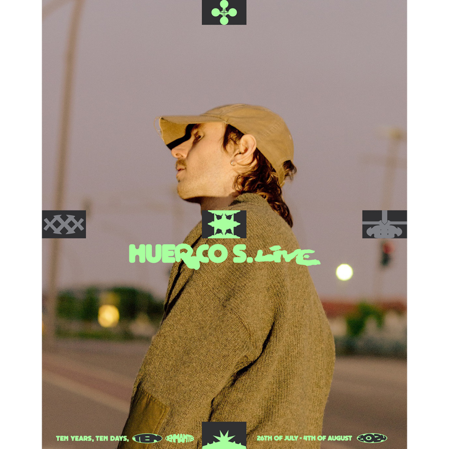
Now exactly a decade old, Dekmantel has firmly established itself as defining the electronic sound of both the present and the future, all while looking to push the boundaries of what one might expect to be experienced at a multi day-festival in Amsterdam.
You might wonder what a graphic designer, an interviewer, a producer and two videographers are doing on a drizzly Wednesday morning in March. We’re walking in the Amsterdamse Bos, in search of bridges. There is no formal map of the bridges, which means we walk from one spot to the next, scouring google maps in search of bodies of water with marked crossings. The beginning of it all is a two line briefing Jonathan received from the Dekmantel team. It had to be bold! It had to be avant-garde! And it had to be remarkable. Most importantly, it had to translate what Dekmantel is: sounds, visuals and special locations all blended up into one collective experience.
Jonathan! Could you introduce yourself?
(Laughs) This is one of the hardest questions you could ask! How to label oneself when you’re curious and explore many things? I’m a graphic designer and artist from Lima, Peru. I've been living in Amsterdam since 2017. When I moved from Peru to the Netherlands I did not know anything about it, apart from a few old soccer players and the big graphic designers from the sixties. But that was it!
"I do think of myself as being a self-taught designer. Before design though, there was music. Music was my school! It was my first safe space to experiment and create whatever I wanted to create."
If you knew so little, what made you move?
I came here in 2016 to attend a summer school in Rotterdam called the Open Set Summer School. It was a lot of different workshops with all kinds of tutors, which really opened my eyes to the different perspectives when it comes to design. It was so nice to interact and meet with these people. One of the tutors, Liza Enebis, ended up being interested in my work so she invited me to work with her at Studio Dumbar in Rotterdam. The following year I moved here with my then partner. She wanted to study here, I had work. It all worked out. From there things snowballed, I worked for Metahaven here in Amsterdam, then I went to Munich to work for Mirko Borsche. For the past five years I’ve been freelancing, doing all sorts of projects.
Even though I’ve had all of these experiences, I do think of myself as being a self-taught designer. Before design though, there was music. Music was my school! It was my first safe space to experiment and create whatever I wanted to create. I owe so much to music and its culture. Also merchandise played a large part in how I understood visual identity and how it functions. Beyond being the best way to support independent bands, it is also a social signifier which shapes your identity as a person. Basically these two things kick-started my interest in design: T-shirts and records. Since then I’ve been living in this circle of music and visuals, it is where I come from and a way of life for me. However, I don’t see any of the things I do as separate. It is all part of the same body of work. Doing visuals, making music or designing is just a way of reinterpreting the world around me.
How do you connect these elements in your practice?
I assemble, or rather reassemble different fragments. Usually these fragments are things I collected like sounds that I record or photos that I take. Also objects I find when out and about. I collect a lot of things, which gives my work this forensic quality. This is also partly out of necessity. When I was younger, I didn’t have much money to spend on materials. I needed to make things out of other things to make music, or find old shitty second-hand gear and try to make it work with what I had. Then I would intervene with something else, and the process of assembling two or more things created something else entirely. This kind of assembling and disassembling has become my default methodology when making something. I also think it is a more sustainable way of working.
So how did this collaboration with Dekmantel come about?
I think the briefing at the time was literally two lines. I remember Bas van de Poel saying something along the lines of “we want to make it avant-garde, bold, and remarkable”. I thought it would be interesting to not let the design be driven by just aesthetics, but by the legacy of the city and how we can incorporate this into the festival identity. In general I also think it is easier to work under the umbrella of a specific concept, in this case, the Amsterdam School Architecture. Many people come here to visit, live, study, or work, but most of the time we know very little about the history of the city itself. It has not always been the way it is not, a smooth city with little space for imperfections! I like to think we are also doing our part in trying to preserve this beautiful history of the city. When I say we, I mean the people from Dekmantel, but also the fantastic team of people that I had the opportunity to put together consisting of Basia Strzezek, Christophe Synak, Liza Borovikova and Savaş Özay.
Do you often look at architecture when working on design?
A lot! I wanted to be an architect when I was in high school, but somebody told me you needed to do and learn a lot of mathematics, and I am so bad with numbers. I just couldn't. But I still love architecture, spaces, and non-spaces, especially wastelands or abandoned spaces. I graduated last year from Sandberg Instituut, and my research was about dirty listening and ambiguous spaces throughout the city.
"This idea of community, while being very expressive, is for me very connected to what Dekmantel has been since the very beginning. Dekmantel is a collective experience, and is also this very bold, strong sonic visual experience."
Did you apply the same kind of assembling and reassembling methodology when working on the new identity of Dekmantel?
Here it is a bit different, because it is more graphic design based. But for sure I incorporated my own way of working, by integrating the relationship between the festival and the city into the whole design. It was important to give the design integrity and a specific aura throughout our research. We wanted to make it meaningful. Also because I have been living in Amsterdam for a while and grew quite attached to it. I wanted to honour this relationship I've developed and highlight how unique the city is.
Amsterdam has been such an important container for Dekmantel over the past ten years. When talking about the legacy of the city, one of the first things that came to mind was the Amsterdam school of architecture, an architectural movement by a group of architects from the 1910s all the way through the thirties. For me this movement is to this day one of the most exciting and expressive architectural movements. They were building houses and public infrastructure rooted in socialist ideals, where the main idea was to create a total architectural experience for working class people. For both the interiors and exteriors they used a lot of different materials, and would assemble all sorts of different styles and colours. This gives it quite a striking and very expressive look and feel.
They built houses, buildings for local institutions and schools. But they also did a lot of urban planning for the city beyond the city centre, and worked a lot at the margin of the city at the time. They were literally building for a community. This idea of community, while being very expressive, is for me very connected to what Dekmantel has been since the very beginning. Dekmantel is a collective experience, and is also this very bold, strong sonic visual experience.
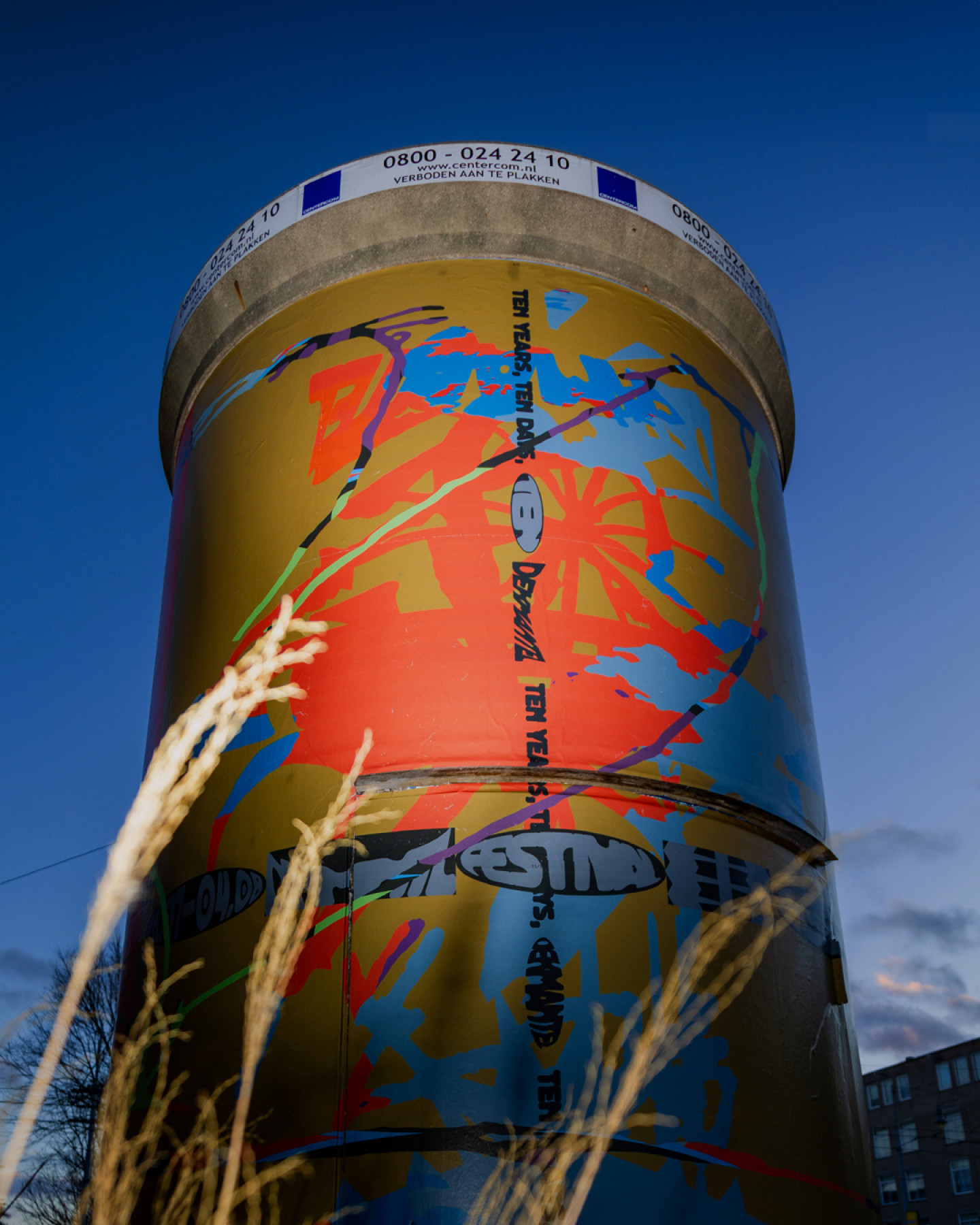
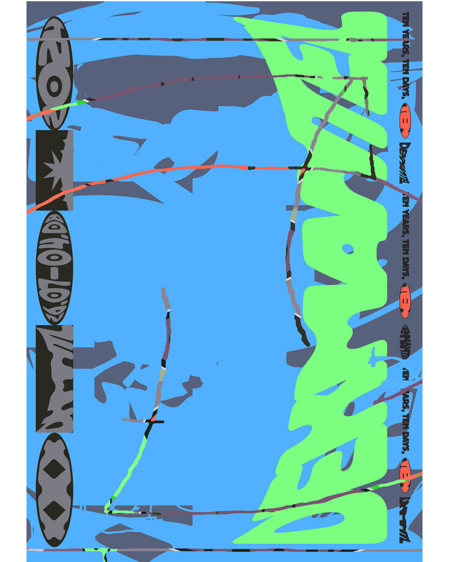
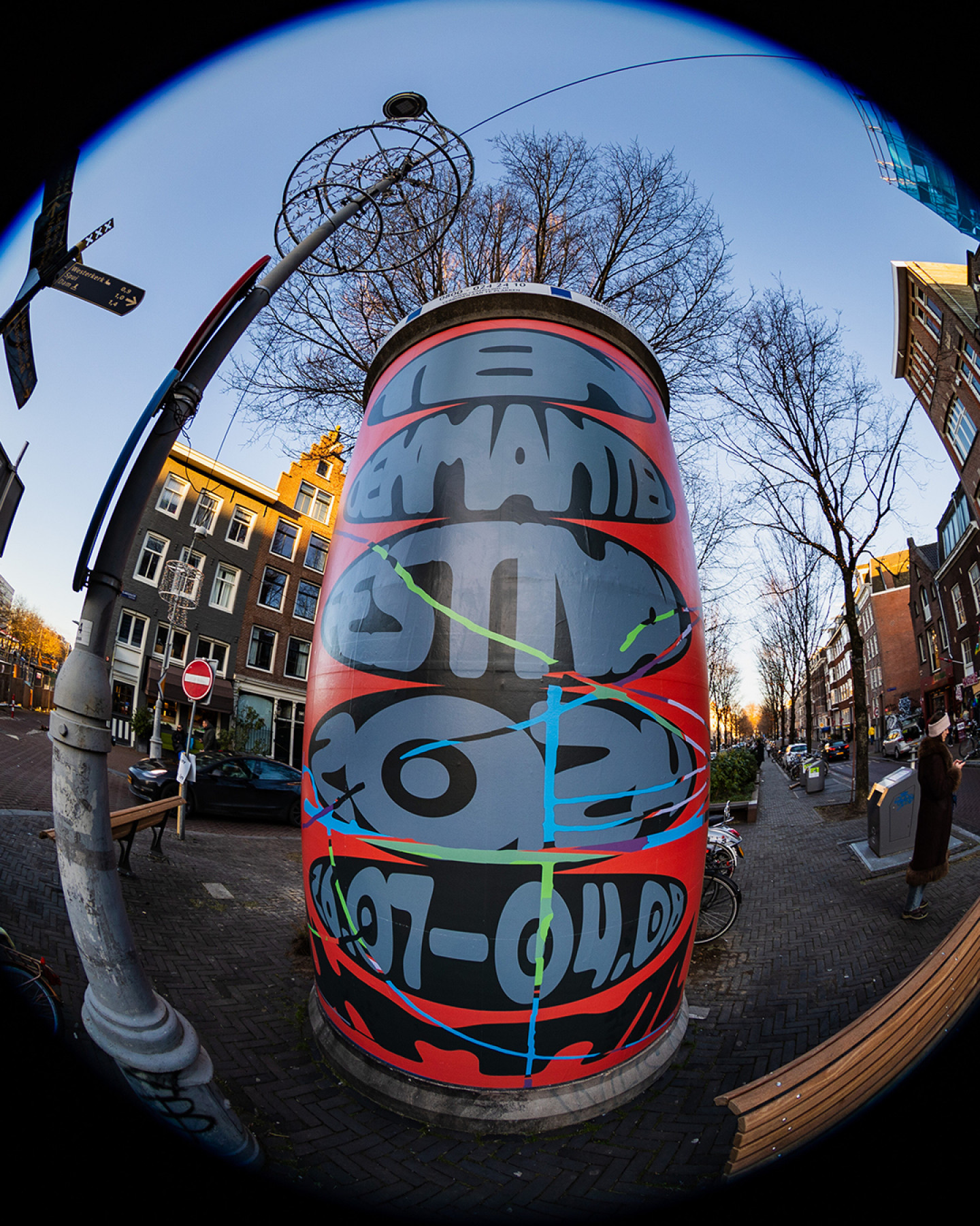
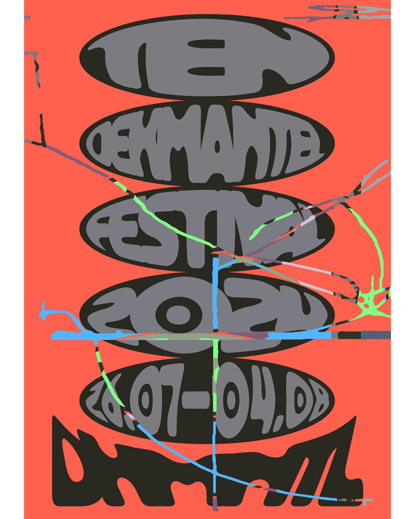
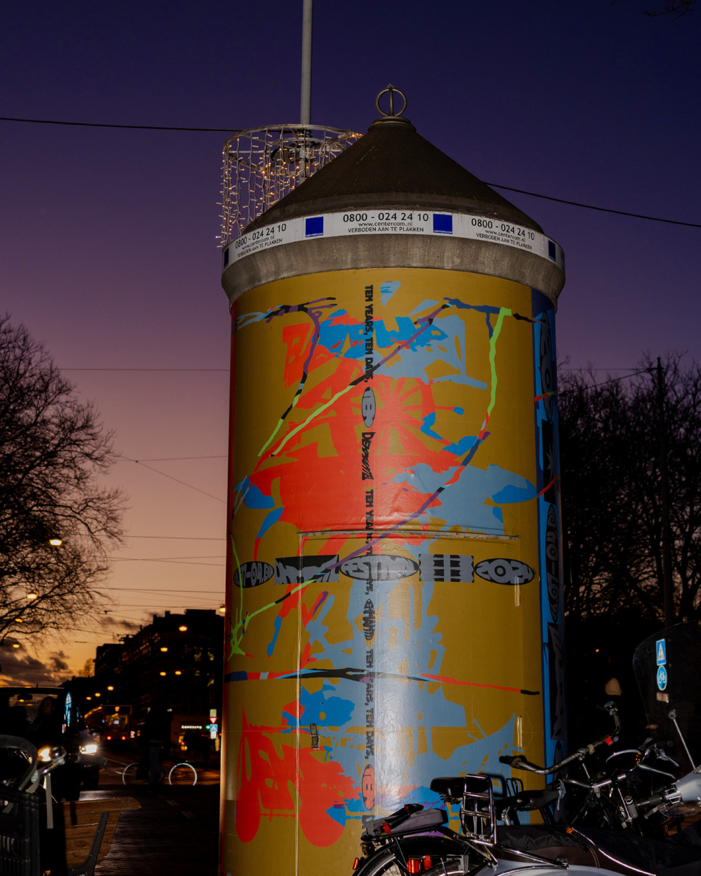
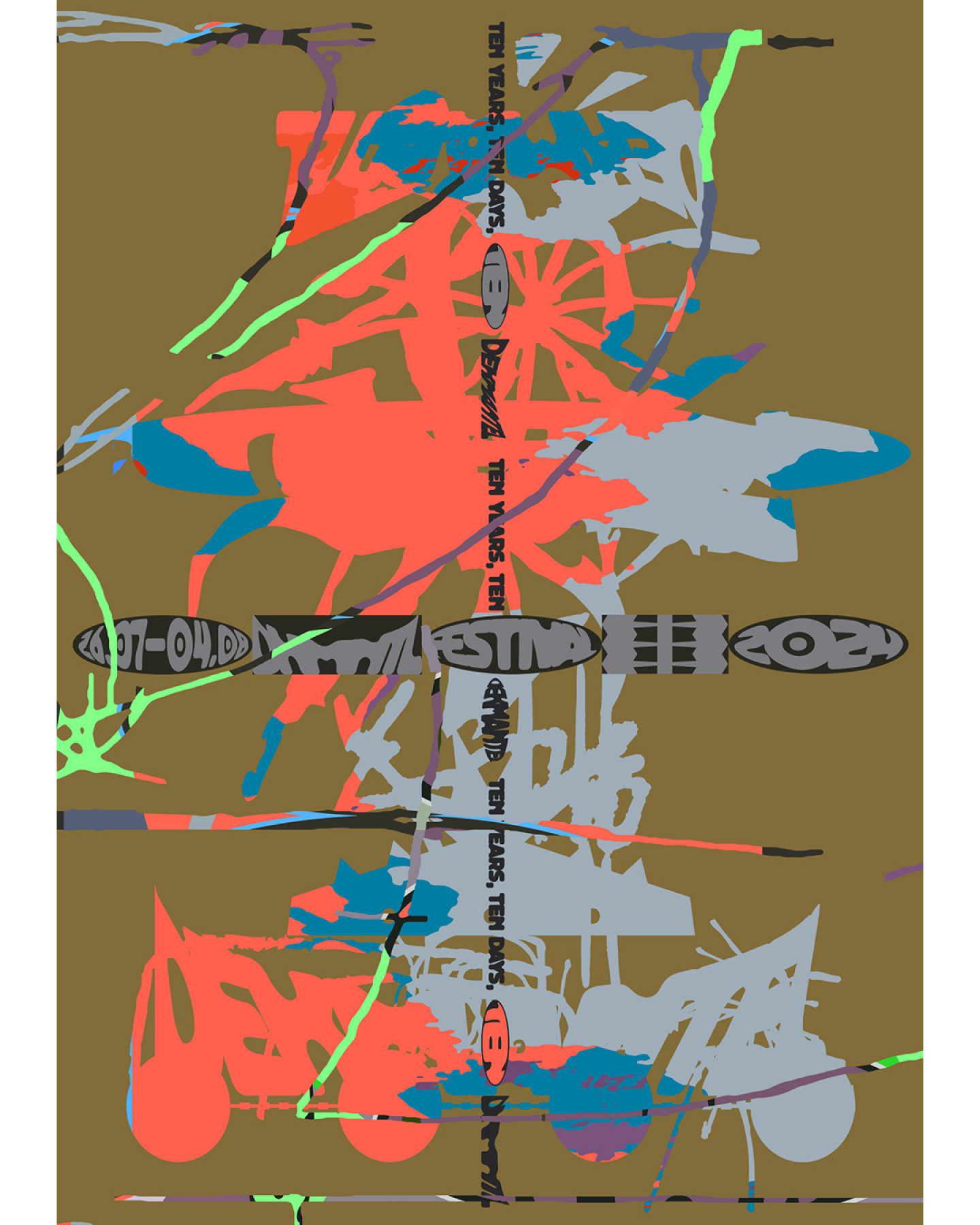
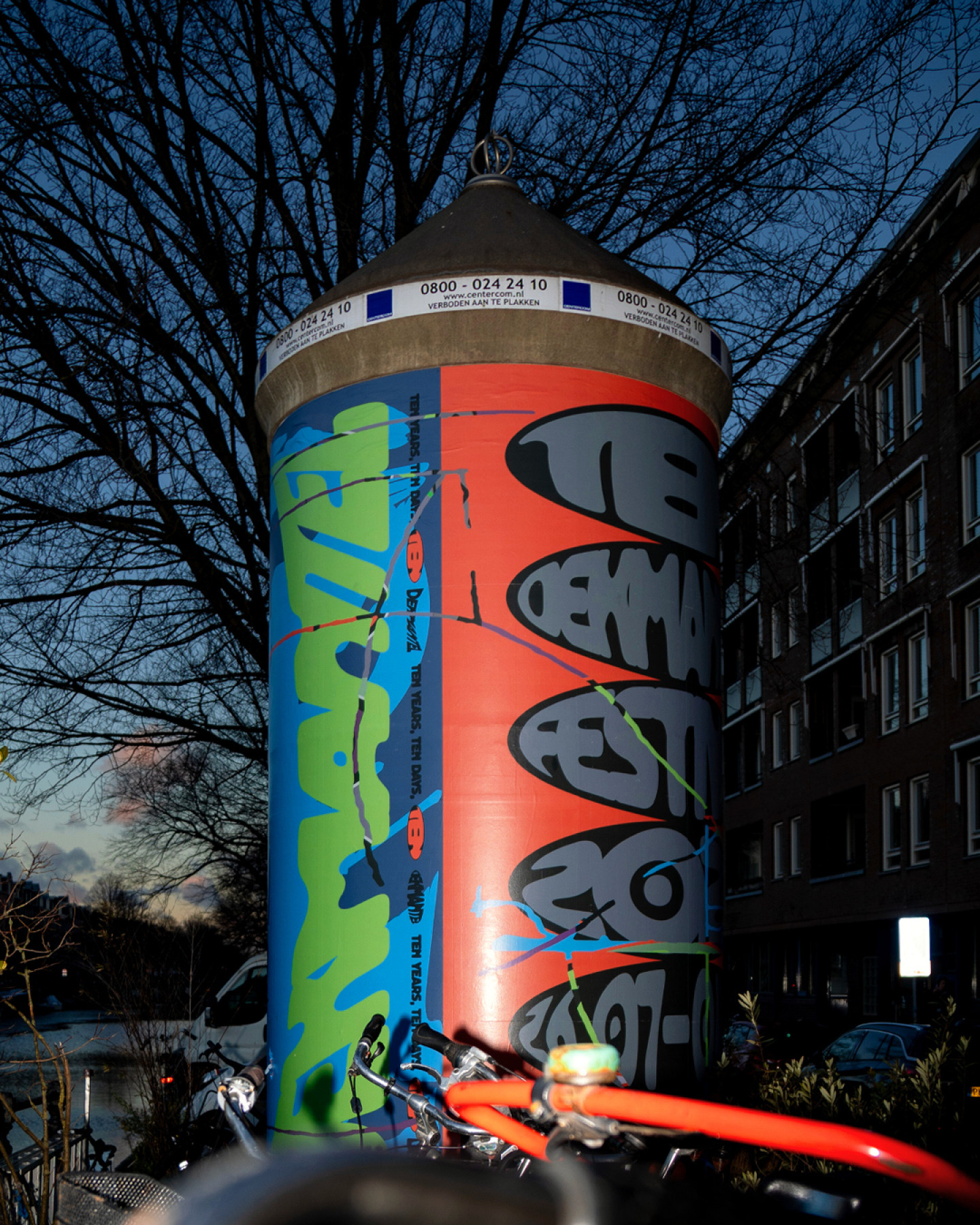
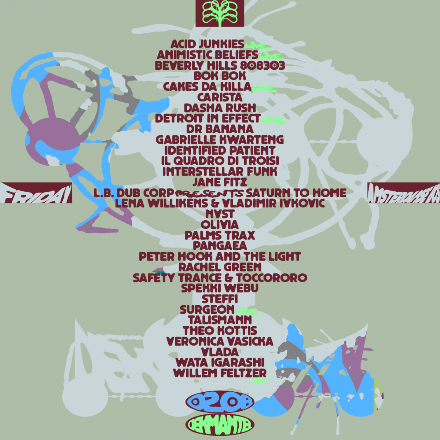
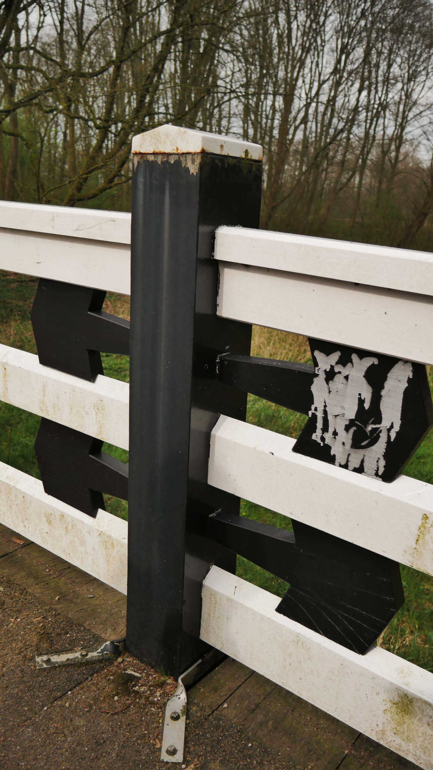
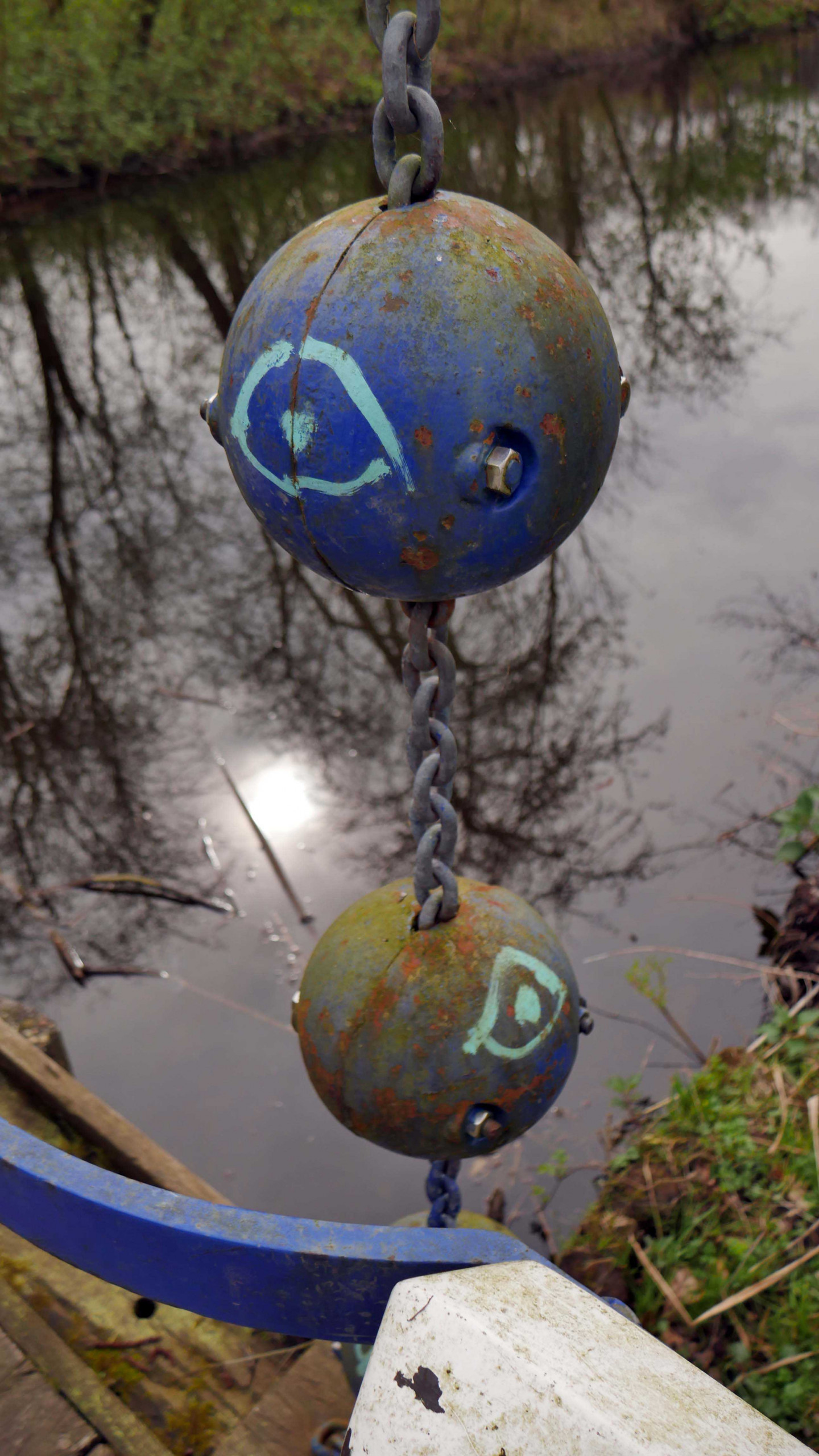
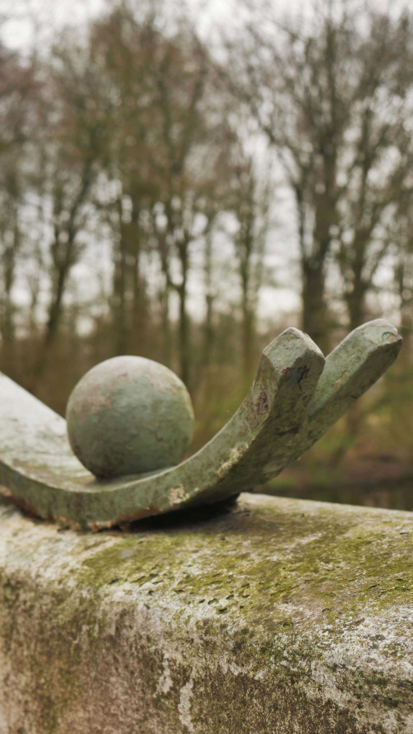
When researching the Amsterdam school, we traced its history back to the Amsterdamse Bos, which is also one of the main locations of the festival. The Amsterdamse Bos is peculiar, because every single tree has been planted in the thirties. It is called “bos”, which translates to a forest or woods, but it is in fact more of a large park, where nature and fiction blend together. Within the Amsterdamse Bos, Piet Kramer, one of the founders of the Amsterdam School was asked by the municipality to design the multitude of bridges crossing the small bodies of water present throughout the park. All of the bridges are unique, with bright colours and shapes that are quite special. All of them have colour combinations that are quite off-kilter. Some of them have organic shapes, others do not at all and they feel like a lot of different decorative elements have been put together that in theory should not make sense, but in the end very much do. It’s a blend of nature and fiction in the shape of these weird, crazy bridges that offer a break with reality when you cross one of them. These bridges ended up being the main inspiration for the identity of Dekmantel.
In the process I was also looking for references on how to assemble a lot of different colours in one visual, or poster. We were looking for ways to go against the grain, go against what is expected in gentle and detail oriented ways. This comes through in the website with the different layouts, the types of font and colour combinations we chose, where just like the bridges in the Amsterdamse bos a lot of the combinations are seemingly off. At first glance it all seems to be a bit too odd, too eclectic…and then when it all gels together, it forms one coherent and most importantly unexpected whole.


Besides the Amsterdam School, I also took inspiration from Chicha posters which are displayed throughout the streets of Lima and bring a lot of colour to the city. Chicha posters are eye-catching screen printed posters advertising concerts and festivals, and they are synonymous with Peru’s indigenous culture. The way they communicate is with this very strong, bold and colourful visual style, which is inspired by the Andean roots.
Amsterdam is not as grey as Lima, but like I said it is a very “smooth” city. To bring in more colour and honour not only Amsterdam itself but also where I come from, I wanted to bring colour in the same way to the streets of Amsterdam. With Dekmantel we made these huge colourful advertising pillars which are sprinkled throughout the streets. For these pillars we inquired whether they could be silk screened, and done with Pantone colours. In the end this was not possible, but this example highlights how the vibrancy of colour was paramount to our approach.
When you see the pillars, I noticed they are legible, but sometimes just barely. In that way they really exist as movement, colour and size more than carrying explicit information in the shape of language.
Yeah, more people have told me that. I think it was a big conversation with the people from Dekmantel. We like to think everybody knows Dekmantel, and we didn’t feel like making another bland informative poster. The focus was much more on creating a visual experience in the streets of Amsterdam, which would perhaps intrigue people passing by, and make you try to find out what it is. This kind of ambiguous quality was important to me, I believe in challenging people through image, rather than handing them a very literal and easy to digest experience. Dekmantel is about music and arts, so the communication around it should have the same feeling. As a festival with a vision, the design should also represent a vision.
We wanted the design to be more fun, more inclusive and also organic. Design shapes space, and we wanted to have soft but expressive and organic artworks existing in public space, enriching our collective experience.