If the task of design is to capture and mirror its subjects, a living, breathing, vibrant festival might be a challenging assignment.
Bureau Borsche: Mirko Borsche and Jean-Pierre Meier
Interview by Helena Julian
While Dekmantel has become known for its progressive intentions, offering genre-bending explorations of all that is electronic, the design needed to provoke the same forward-looking desires. With Bureau Borsche, Dekmantel has found its ultimate match. In conversation with designers Mirko Borsche and Jean-Pierre Meier, I ask how they would describe the impressive visual results. “Stubborn is a good word”, they reply. “Or almost irritating. You have to show some resistance in order to create focus. But you have to play it right.”
HJ: As a design office, you deliberately choose to also work with organisations from the cultural field. What is the value of working with an organisation such as Dekmantel?
Mirko Borsche: When I founded the studio in 2007, we quickly attracted cultural projects such as doing the creative direction for Zeit Magazine or Bavarian State Opera, and from there we moved in different cultural directions. We’ve worked with fashion brands such as Givenchy and Balenciaga, and we have worked in sports through Nike and by redesigning football club Inter Milan’s branding. But we have also worked with smaller music venues in Munich, where we are still based today.
Jean-Pierre Meier: I remember us being flattered when the invitation of Dekmantel came in. I grew up with the Dekmantel sets on SoundCloud and YouTube. We had been following Dekmantel’s work for years but from the position of a fan. So when Dekmantel invited us, we quickly understood what the festival intended to be. We share a mutual ambition with Dekmantel of exploring interesting ways of expressing a vision. The festival's commitment to pushing boundaries and finding fresh approaches aligned perfectly with our own desire to innovate and create meaningful experiences. Designing for Dekmantel was a meaningful opportunity for us to contribute to a festival that holds immense value for young people and the electronic music community as an entity. It was a chance to leave our mark on an event that has shaped our own musical journey, and as designers we were very grateful for this experience.
HJ: To me the design that Bureau Borsche delivered for Dekmantel reads as integral, uncommon and most of all determined. What were your main influences in the design process?
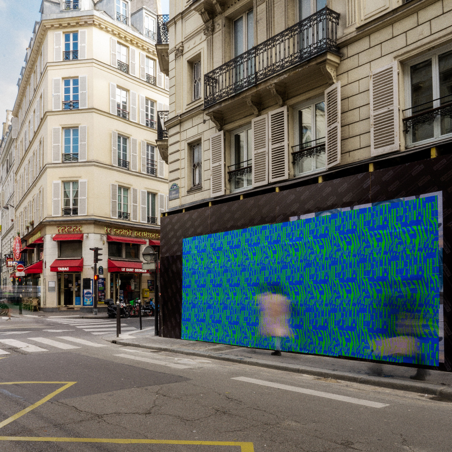
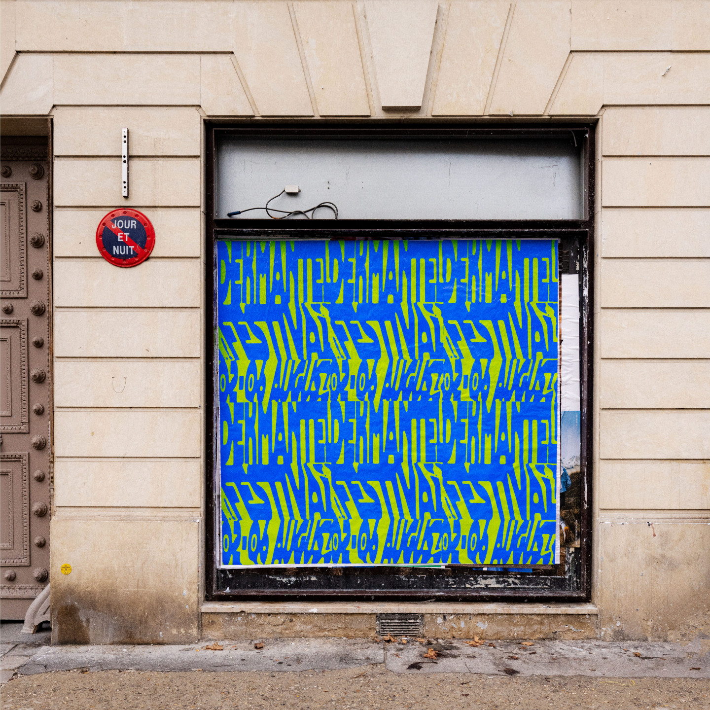
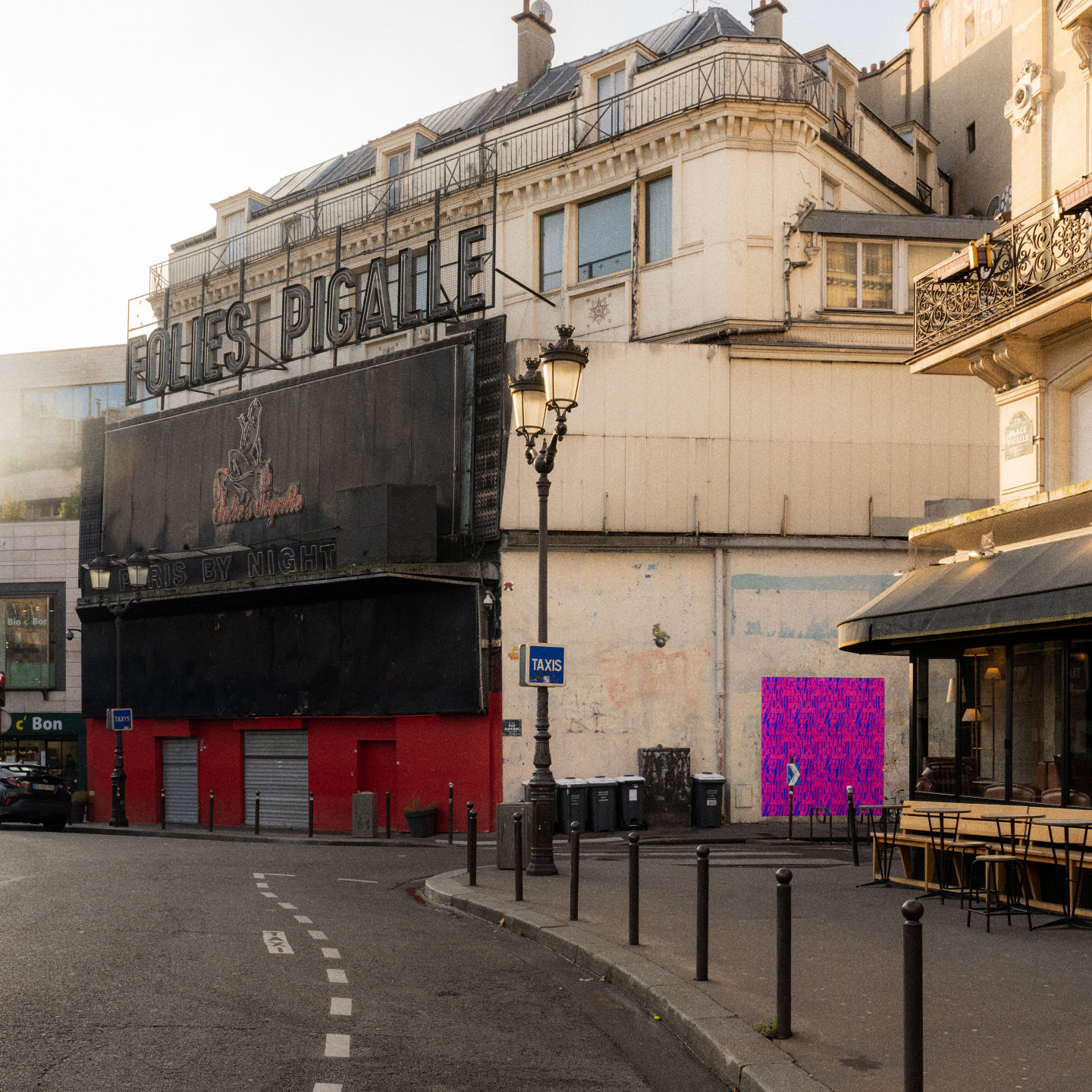
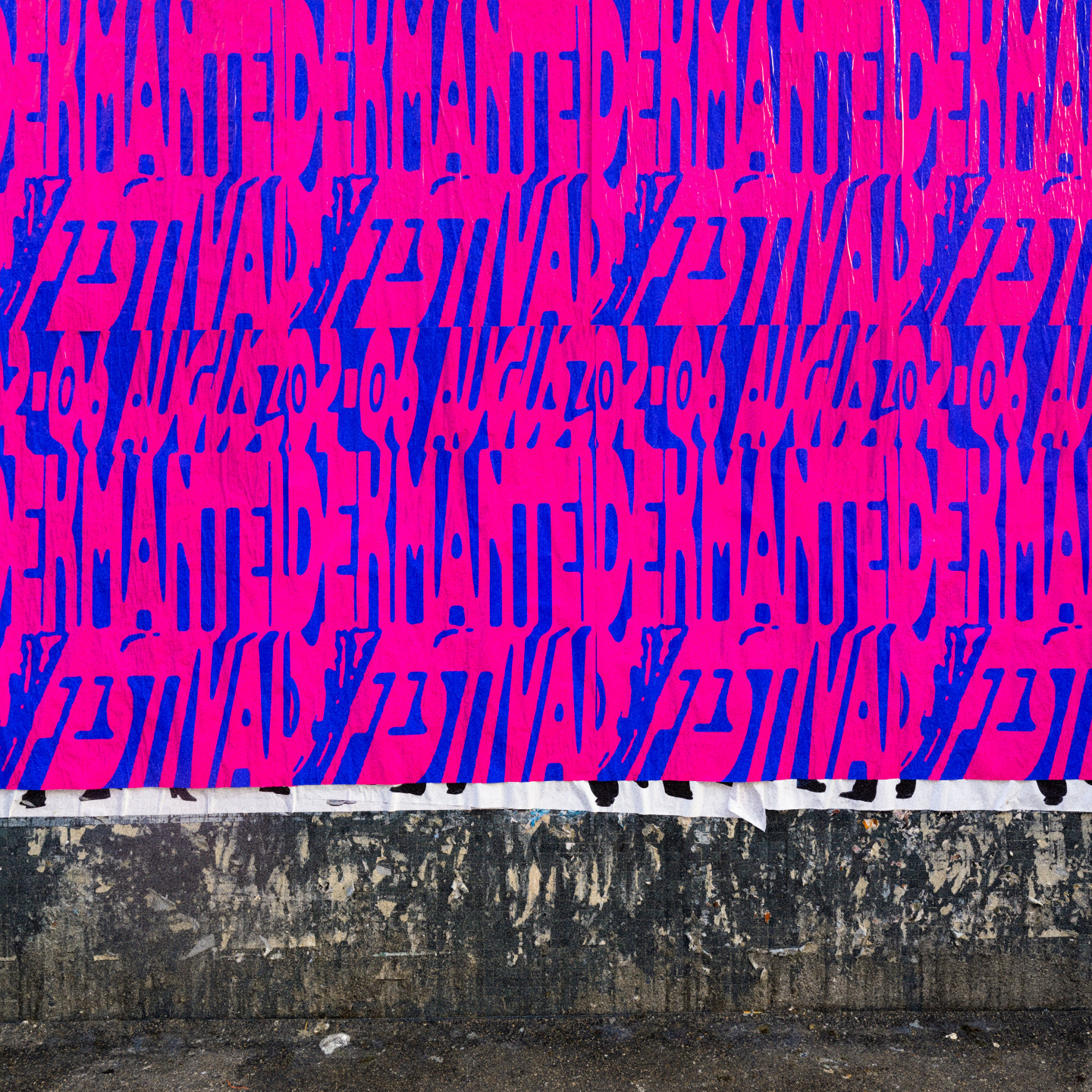
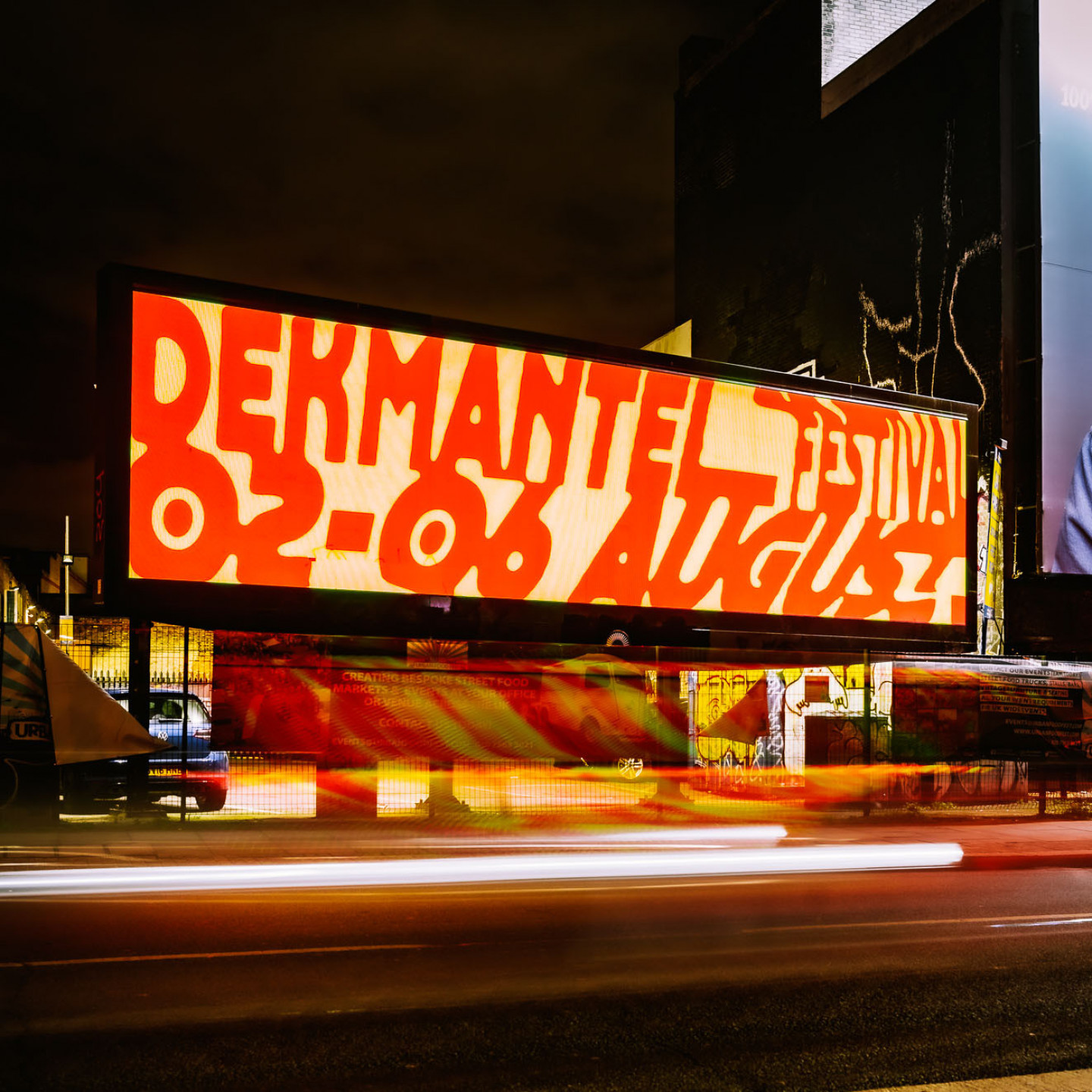
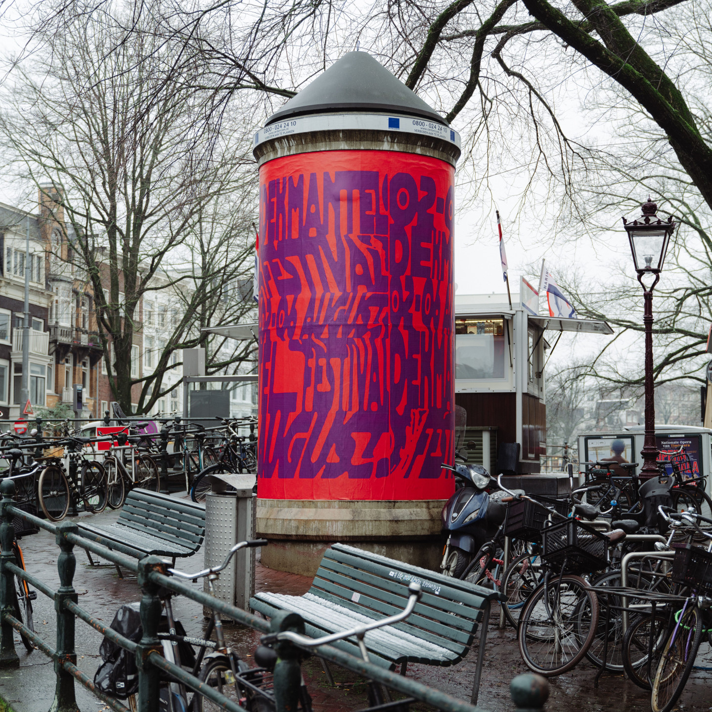
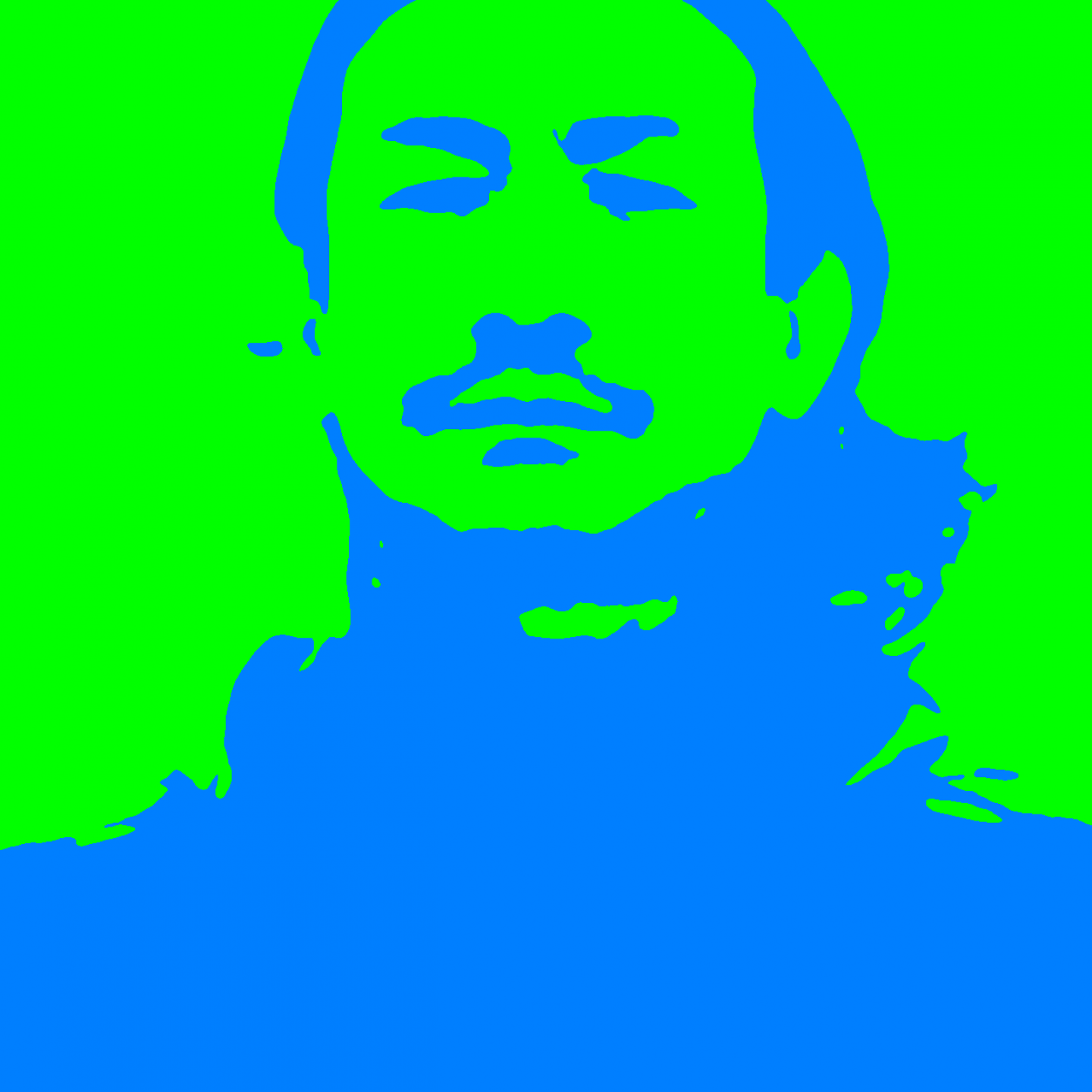
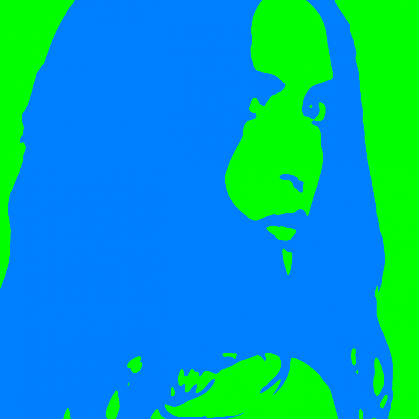
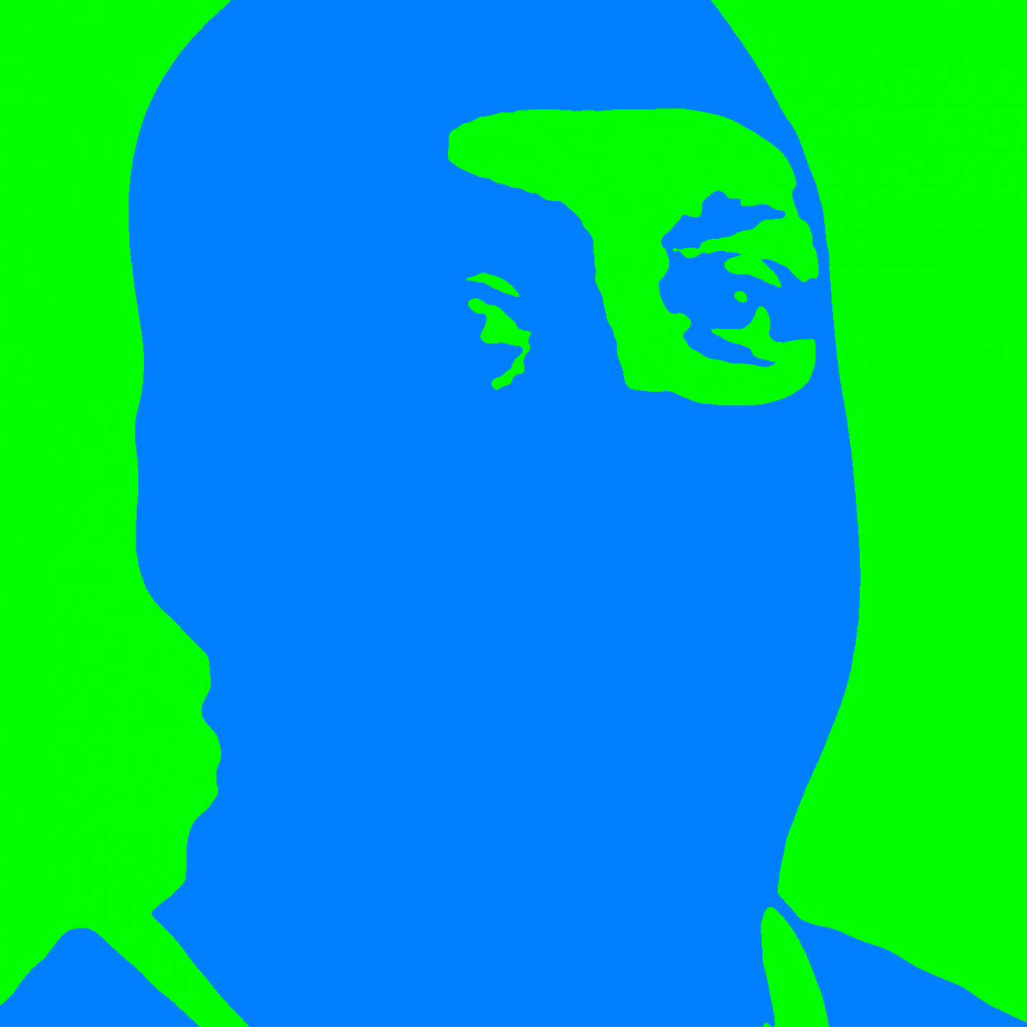
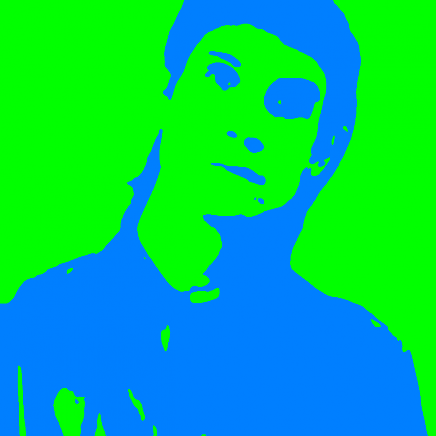
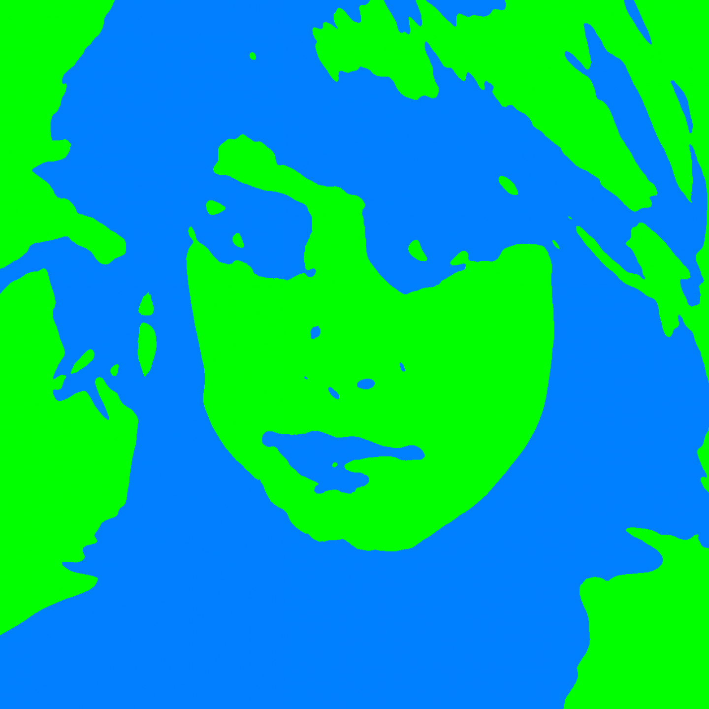
MB: A few parameters, such as the logo and the typeface, were already set before we were involved. That meant it was a challenging proposal with some limitations. But we decided to invest much more in a feeling than in a design. We were inspired by the idea that the design could vibrate; that it is almost a trip in itself. You can see the pop references with the highly contrasting colours and visuals that are on top of each other just like a filter. It is choosing intuition over functionality. We also very much wanted a design that you couldn’t frame in a specific period in time. It could be from the early days of techno, or it could be twenty years from now.
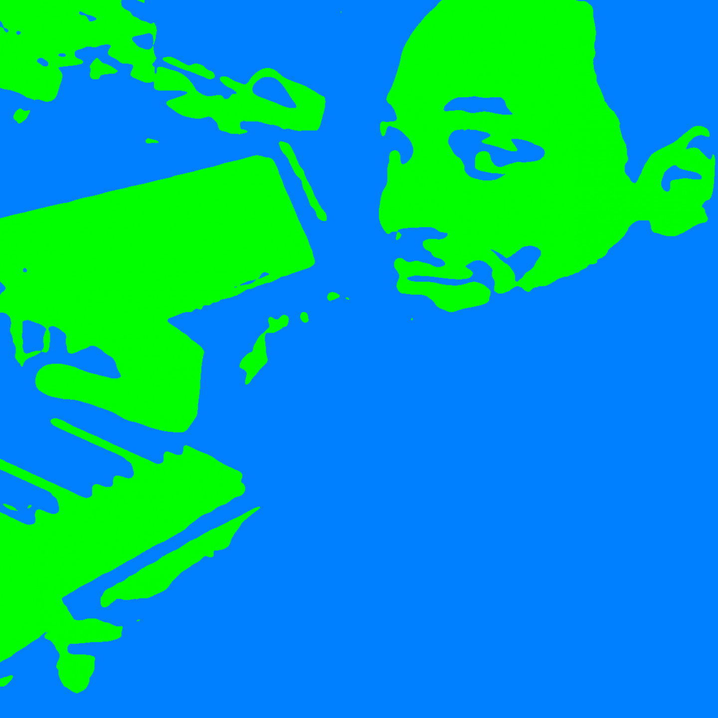
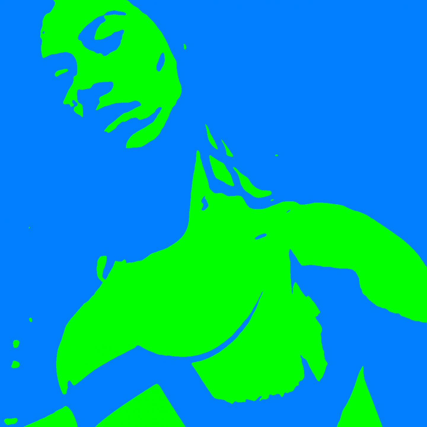
JPM: We wanted to get as close as possible to the universal feeling of being in a club. Sometimes there’s this moment when you realise it’s all a bit too much: too many vibes, stroboscopes, colourful lights, super hard techno pumping through the space. We wanted to add feelings on top of other feelings. In one of the trailers we created the feeling of a sensory overload, and the video ends with a distant ringing: much like how your ears sometimes feel after leaving the club.
To translate this intense club experience into a visual form, we drew inspiration from various artistic references, including drawings which are influenced by rave culture. We incorporated elements of their energetic shapes, bold colours and liquefied typography to convey the immersive atmosphere of a club. Another source of inspiration for our design was the trailer of the movie "Enter the Void", directed by Gaspar Noé. The trailer is striking and hypnotic, using intense lighting, surreal typography and pulsating visuals. It resonated with our vision and served as a reference point to create a transcendent experience within the festival space.
HJ: Is that also what defines you as a design bureau, that you try to evoke an emotion over a function?
MB: I am certain people choose us for exactly that. Our designs are not the smoothest. But there is more behind it. We try to find ways of how people can spend time with the work. You need to invite them, but you also need to make them stay. Often that means that you offer something that isn’t easy or super accessible. The design asks for attention, but offers a lot in return. For example: we once made a fashion publication with a very small font size. The people who read all the way through said they felt satisfied, as if they had to work a little to get through to the piece.
JPM: When creating any visual material, whether it's a website, a poster, or a brochure, it's crucial to ensure that information is easily digestible and visually appealing. After all, if consumers can't comprehend the message or find it challenging to navigate, they are unlikely to engage further. While accessibility and readability are vital, there are instances where it becomes necessary to push the boundaries and make exceptions. It's through unconventional typography, hard colors, and overloaded layouts that we captivate and engage audiences on a deeper level. While maintaining accessibility principles, we try to find ways to still spark curiosity.
HJ: Is this idea of spending time with the work perhaps where design is similar to music? Are there any connections between both?
MB: For me music and design very much go hand in hand. I grew up listening to records and that was a whole different experience. You would have something to listen to and something to look at; the cover design. You read them together, as the full message of what the artist wanted to communicate. Soon after MTV became popular and that was a whole different way of looking at music. Nowadays there are a lot of labels and festivals that are pushing out visuals and really thinking through concepts. It’s interesting to be part of that evolution.
"Nowadays there are a lot of labels and festivals that are pushing out visuals and really thinking through concepts. It’s interesting to be part of that evolution." - Mirko Borsche
JPM: Working for artists and the music scene is a very personal process. As a designer you become part of what the artist wants to express. There are very few artists that design their album cover themselves, so you really need to understand what the message tries to be. Designing emotions, however, is a lot more complicated than designing a brand, but it’s highly satisfying.
MB: It’s been interesting for us to consider what this means at Dekmantel. In times of Artificial Intelligence, I feel we crave a digital creation that still has a human touch. That’s what we have tried to do with this design. It mirrors what the festival tries to do with electronic music as it’s a digital platform for human expression. All in all, you want to feel the human connection.